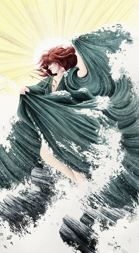
Potentially embarrassing but true, this is a redraw of what's more or less a high school OC. In original imaginings she had a top of some kind, and I briefly wondered if social media guidelines would require me to put little stars or something over her bits, but it looks like because this is a painting of a statue... I should be in the clear.
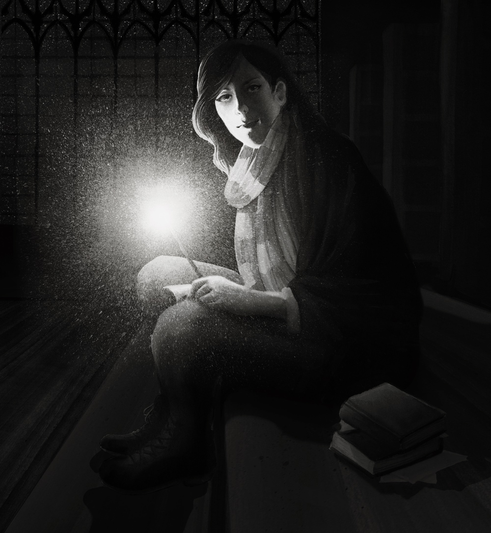
Noir Selfie
I totally don't smoke, but I'm still suckered into the tough, detached glamour vibe that smoking has in Noir films.
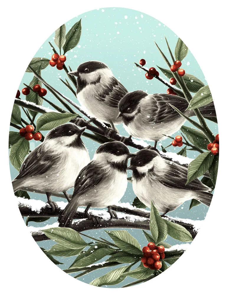
Chickadees
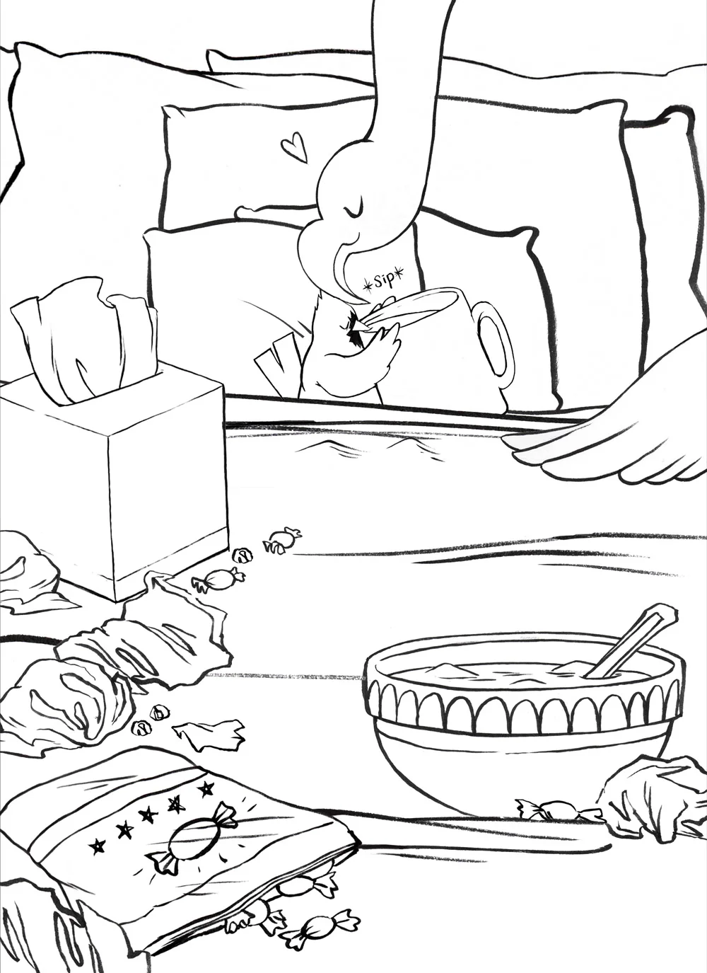
Siiiiiick
I've been sick for the past... almost week and a half... And I guess I'd like to thank a combination of love, soup and cough drops for the reduced amount of coughing these days. Now that I'm on the mend, you can count on more way drawing and a few more birds too.
Sketch to Black and White
Bluejay
The first in an ongoing series of small birds.
Space Oddity
It was a sad day when Bowie passed early 2016. Here's to hoping 2017 doesn't take so many beloved artists.
Ghoul-friend
A present for a hardcore Fallout 4 fan. Even now I still haven't played with John Hancock as a companion, but I really should one of these days. Before said Fallout fan finds out.
When I had used colored pencil for my work, it was nearly impossible to get a true black or decent contrast without introducing other media. It can definitely be done, but a lot of smooth papers good for colored pencil work don't handle liquid well (ink or watercolor being the preferred add-on. You can use gouache, but black/dark gouache will always scan differently than shiny, waxy colored pencil). Switching to ink has been really good for the dramatic lighting I've been wanting to do.
2001
Another old favorite of mine- still figuring out how best to use both the traditional and digital parts of my process. This is a redo of an older, much less successful illustration for class.
The Golden Arrow
I still don't consider myself very good with color- especially digital color despite how often I use it. But I came out of this was super pleased with everything about it. It was good for morale at the time- I was between semesters trying to keep up with making things, and moving out of my apartment on top of that. For that reason, it's also a pretty nostalgic piece for me.
Florence + The Machine
This was a summer break project, and one that kind of set the tone for a TON of more recent work. Using parallel lines like this makes it easier to get even values with dye based ink, which soaks in pretty fast and can't be moved much once its down.
By the Docks
Honestly out of the three Samantha pieces, this one was my favorite. Partly because it was the most fun I'd had with textures up to this point, but also because it had the most digital intervention I guess? Adding or manipulating shadows has become super important in more current work.
Attack of the Killer Ceiling Fan
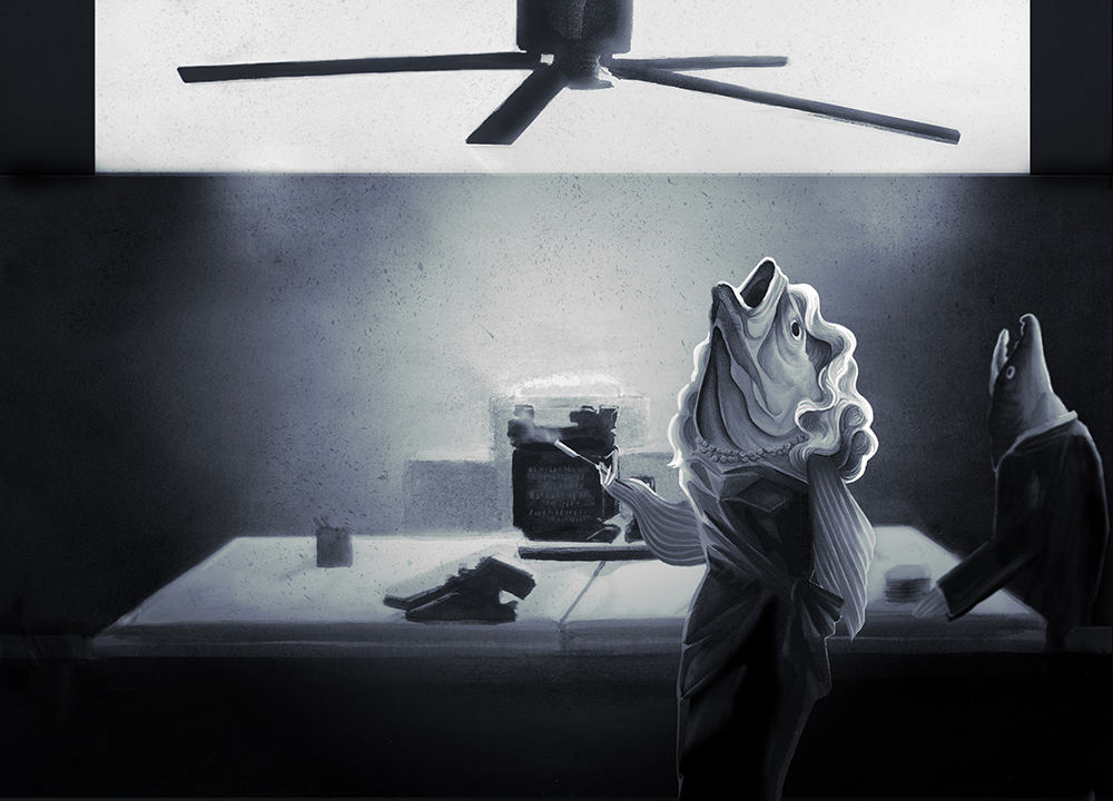
This is the second of that series. One of my illustrations crushes Victo Ngai came in to our ink class to participate in the critique. She seemed to like my noir fish people enough, but was distracted by the previous crop of this image...
...In which the ceiling fan seemed to be... the source of drama. I guess it makes sense that that would happen with characters that can only stare upward, mouths agape. I did my best.
Intro to Compositing
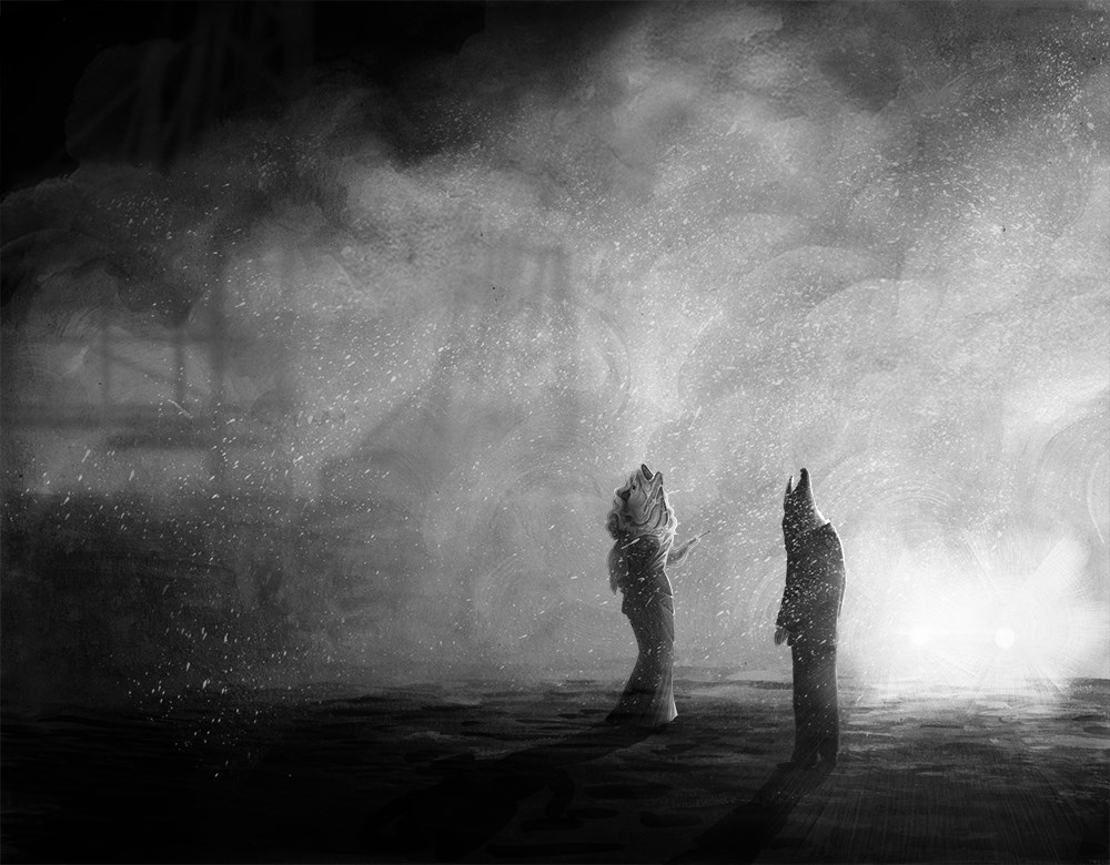
I took our friend from my previous post and continued using her for the next few pieces. This one, part of a series of three, was an assignment using two characters and three scenes... Which ended up being a super fun way to play around and find variety in repositioning existing elements.
Samantha
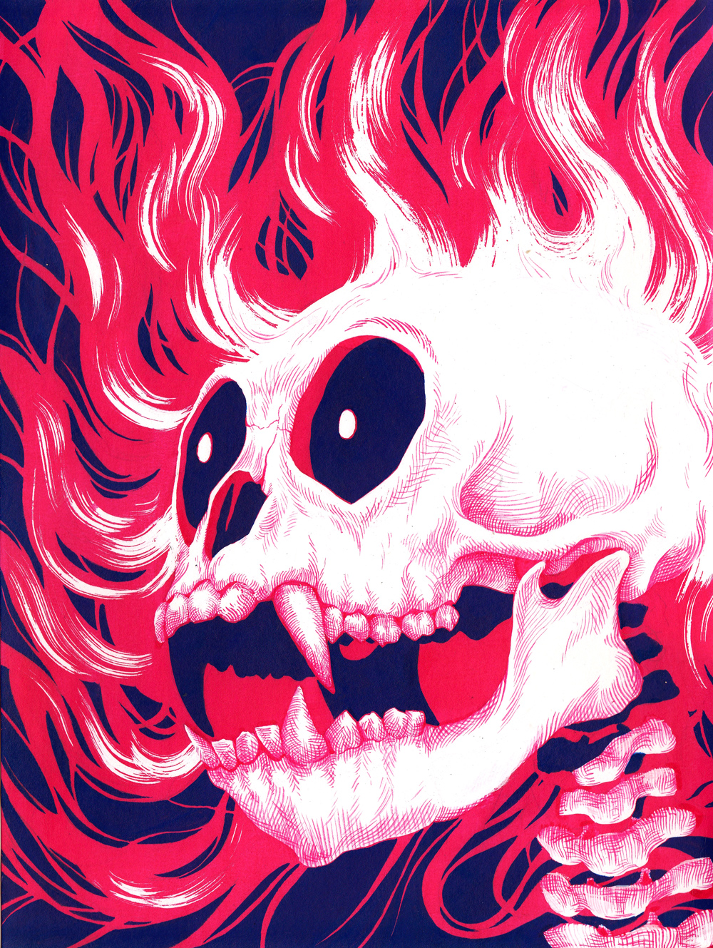
As part of an ink class assignment, I did an ink wash piece with the skeleton of a magical creature. This little lady here is the first thing I ever did in dye based ink, which is by far my favorite media now. Her name is Samantha, and she has an entire backstory that... I think I won't go into right now. But maybe one day...
Flower Chain
I started art school off doing a lot of colored pencil work. I came in all confident with my 72 set of Prismacolors, but that didn't pan out. I did as good of work as one can with colored pencils, but they're hard on your hands and they're garbage when it comes to contrast. I made the switch to ink wash and compositing pretty late in my art school career. I'm really glad I did.
Wrath
I did two versions of this assignment- the first piece (as well as the critique it got) weren't what I wanted, so I went back and did a more carefully rendered version of basically the same thing. I forget sometimes how helpful it is to throw out a bad drawing and just start from scratch.
This piece was done in FW acrylic inks- they aren't my favorite, but they carry some really fun colors.
Back to the Beginning...
With a new website comes a new blog... Here for the first few posts, a little look back at art school and a little later, the things I've done in my first year out. For those of you who have traveled back this far, thank you- it's been quite a journey!
